
Algunas instalaciones murales de Mónica Bengoa, en gran parte reunidas en este libro y en esta retrospectiva, responden de diferente manera al desafío de reproducir una imagen a través de materiales que oponen resistencia a dicho cometido[1]. Esa resistencia está dada principalmente por el hecho de que esos materiales no pueden ser triturados ni reducidos durante el proceso de elaboración; por el contrario, todos ellos conservan su forma y carácter unitario, incluso una vez terminada la obra. La construcción de la imagen mediante esas unidades y la inevitable formación de intersticios entre ellas interrumpen la continuidad de las formas, pero en un nivel más elemental imposibilitan una gradación fluida de los colores.
El curso de “Color” de Josef Albers fue diseñado y sistematizado hace ya más de ochenta años[2], pese a lo cual los artistas que lo imparten actualmente en las diferentes escuelas de arte de Chile se atienen bastante al modelo. Podemos encontrar, de todas formas, algunas variaciones en la metodología de enseñanza que resultan particularmente significativas. Hay quienes prefieren mezclar los colores utilizando pintura, pese a que en el libro se insiste en el uso de papeles ya coloreados. Hay quienes se abocan, en cambio, a la elaboración de sofisticados mecanismos electrónicos para comprobar la consecución de los objetivos de determinados ejercicios. Y hay quienes incluso optan por dejar fuera del programa el examen final estipulado por el mismo Albers, consistente en la reproducción o interpretación de una pintura medianamente conocida a través de la adhesión de diferentes papeles de color a una superficie de cartón forrado. Un artista y profesor de Color incorporó en su versión del curso el siguiente pie forzado. La pintura a reproducir con papeles de colores en el examen final debía ser anterior al año 1911 “¿Por qué creen que debe ser anterior a 1911?” pregunta a sus estudiantes al momento de dar las indicaciones para el examen. “Porque ese es el año en el que Vasily Kandinsky realizó su primera acuarela abstracta”, responde él mismo.
En su momento, esa restricción me hizo bastante sentido –yo misma la he incorporado en mi propia versión del curso. Efectivamente a partir de la abstracción pictórica, entendida como el movimiento artístico de vanguardia que abrió la posibilidad de prescindir de la representación de un modelo reconocible, el color en la pintura deja de ser un medio para pasar a ser en sí mismo un problema. Pero –podrían preguntar los estudiantes– qué relación tiene eso con el encargo. Mi respuesta sería que, en términos más concretos, el abandono de la representación de un modelo reconocible puede llevar también al abandono de la representación ilusionista del volumen y el espacio, la cual muchas veces se obtiene a través de la gradación de tintes o tonos –las llamadas “luces y sombras”. En la pintura abstracta, por lo tanto, en lugar de esa gradación tonal solemos encontrar superficies planas de color, lo cual es consistente con el protagonismo que se le ha asignado a dicho elemento. Trabajar a partir de una pintura abstracta o incluso a partir de una pintura figurativa posterior a la abstracción –como podría ser una pintura de Alex Katz– impide que los estudiantes se enfrenten a una de las mayores dificultades del ejercicio: lograr obtener el efecto de una gradación de colores, la ilusión del cambio ininterrumpido de un tinte determinado a otro, pero mediante un procedimiento completamente adverso a dichos propósitos.
Si bien las instalaciones murales de Mónica Bengoa son el resultado de una operación similar, no parten de una pintura perteneciente al canon de la historia del arte, como los estudiantes en el examen del curso de “Color” de Albers, sino de una fotografía de espacios y objetos cotidianos tomada por ella misma. En general la dificultad para reproducir una fotografía es todavía mayor que la dificultad para reproducir una pintura, aun cuando se trate de una pintura anterior a ese hito fundacional de la abstracción ya mencionado. En la fotografía la variedad de tonos es mucho mayor que la de una pintura, dadas las posibilidades técnicas del medio que tanto maravillaron al momento de su invención y sobre las que tanto se ha teorizado desde ese entonces. Para no ir más lejos, en uno de los ensayos sobre fotografía de Rosalind Krauss, la teórica señala que la nitidez de los primeros daguerrotipos enseñó a los pintores de la época la pobreza de su propia percepción visual, y en consecuencia las limitaciones de su propio medio artístico[3]. Pero, llegado a este punto, quizás sería prudente preguntarnos qué nos hace suponer que un gigantesco mural hecho de servilletas de papel[4] se basa en una fotografía y no en cambio en una pintura, dibujo, o incluso la observación directa del modelo. El motivo en apariencia anodino de esta instalación mural de servilletas –un conjunto de juguetes repartidos en el suelo debajo de una cama a medio hacer– remite a cierta idea ya consensuada sobre lo cotidiano. Pero este motivo también remite a un cierto tipo de imagen que se ha abocado expresamente a su registro en los últimos años: la fotografía aficionada o doméstica, cuya historia se remonta a la invención y comercialización de las cámaras portátiles. Solía pensar que, tras una inicial investigación fotográfica sobre las actividades diarias, el sentido de lo cotidiano en la obra de Mónica Bengoa estaba orientado principalmente a generar un contraste con su metódico y, en cierta medida, impersonal sistema de trabajo. A la luz de esta reflexión ahora pienso, en realidad, que lo cotidiano en sus murales cumple otra función: ser el testimonio de su origen fotográfico, y con ello de las particularidades de su proceso de elaboración.
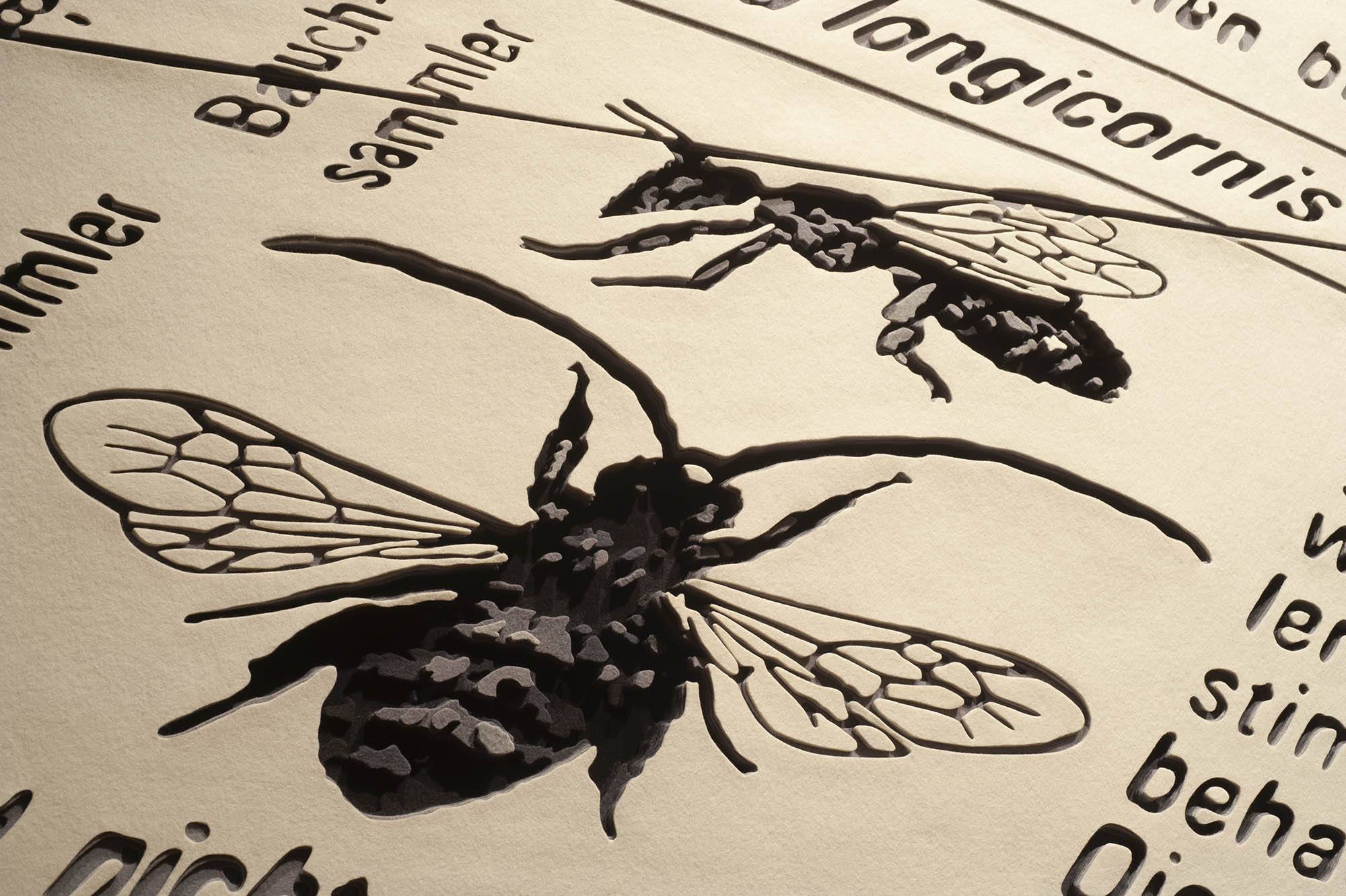
En el mural de fieltro Algunas consideraciones sobre los insectos: Abeja de antenas largas (2010) se representa lo que pareciera ser una enciclopedia abierta de par en par. En la parte inferior izquierda encontramos una abeja de frente y de perfil, tal como se suelen representar las especies animales y vegetales en los libros científicos desde tiempos muy remotos. Sus contornos son sumamente definidos, incluso en la zona interior de sus translúcidas alas. Esa definición es lograda mediante una clara delimitación de las formas y un uso contrastado de tonos oscuros sobre un fondo claro. Las palabras que rodean a la abeja –y que podemos suponer que refieren a ella– también son nítidas en su cercanía, pero a medida que se van alejando comienzan a ser más difusas. Se trata, por lo tanto, de una imagen con una zona enfocada en donde se encuentra la abeja (también destacada en la bajada de título de esta obra), y una zona desenfocada correspondiente al resto del libro. Ahora bien, más allá de que el enfoque y desenfoque en esta imagen delate su origen fotográfico –tal como lo hizo el motivo cotidiano en el muro de servilletas– también plantea un asunto que compete a toda reproducción de la imagen. No sólo los motivos sino también los procedimientos de un medio de la imagen como la fotografía pueden ser reproducidos en otro. El punto es encontrar cómo.
En el montaje de estos murales, por lo tanto, junto con la imagen se despliega la proeza técnica que posibilita su definición. Y pienso que desplegar es, en este caso, un término tan apropiado como sugerente: las plumas tornasoles de un pavo real se despliegan para deslumbrarnos, así como los naipes de una baraja se despliegan para revelar el truco, el juego. En este caso la experiencia del despliegue –también deslumbrante y reveladora– es prácticamente simultánea para Mónica Bengoa y nosotros. La escala de estas obras imposibilita que la artista pueda ir contemplándolas durante el proceso; sólo es capaz de observar cada una de sus partes por separado. La traducción de cada uno de los colores, por lo tanto, se realiza de manera aislada. Bien podría suceder que al unir finalmente cada una de las partes los colores no interactuaran tal como esperaba. Pienso en una historia que cuenta Raúl Ruiz –que tiene más de una variante– sobre dos escuelas de pintores de un país indeterminado, obligados a representar sólo y únicamente al mandatario. Ambas escuelas deciden elaborar su retrato por partes, como si fuera un enorme rompecabezas. Sin embargo, mientras los pintores de la primera escuela se atañen al modelo, los pintores de la segunda van añadiendo pequeños trazos en el trayecto. Sólo al final caen en cuenta de que han eliminado todo rastro del presidente, y obtenido en cambio la pintura de un paisaje[5]. Antes de empezar, la artista elabora una suerte de guía, por lo que la construcción de sus murales no corre esa misma suerte. Pero además, se asegura de que ninguna inquietud que vaya apareciendo en el camino intervenga en el resultado; ninguna pincelada que haga de un retrato un paisaje. Para ello, analiza y descompone la imagen referencial en diferentes zonas, de acuerdo a los tintes y tonos presentes en ella, pero también y sobre todo de acuerdo a los colores de los que dispone para trabajar. Con la idea de un arte que hace del procedimiento la obra, en el año 2009 Mónica Bengoa expuso en la Sala Gasco seis de esos “planos de construcción”, uno de los cuales se encuentra en esta retrospectiva: musca domestica (mosca). Si bien otro de los planos exhibidos había sido utilizado para la elaboración de una imagen hecha de cardos teñidos, musca domestica en cambio nunca cumplió esa función. La otra guía que a veces elabora la artista es un muestrario de todos los colores disponibles según el material. No puedo evitar imaginar esa restringida “carta de colores” como un conjunto de tarjetas con una o dos columnas de recuadros e inscripciones, tan meticulosas y coloridas que merecerían ser también exhibidas. Lo interesante, sin embargo, es que en la medida en que la artista va avanzando en el trabajo ya no necesita consultar guía de ningún tipo, siendo capaz de identificar de manera inmediata cuál es el color que corresponde a cada zona. En otras palabras, el ejercicio reiterado de traducir un color a otro termina convirtiendo a la propia artista en un programa de traducción. Una capacidad adquirida durante el proceso, prácticamente imposible de traspasar a otra persona, y que ciertamente cuestiona el carácter mecánico de este tipo de labor.
No es fácil reproducir una imagen fotográfica con fieltro, burel, o hilo, o servilletas por una razón bastante evidente. A diferencia del pigmento pictórico, esos materiales no pueden ser mezclados entre sí para obtener otros colores. Eso obliga a trabajar solo y exclusivamente con los colores que vienen de fábrica o, en el mejor de los casos, obtener otros tintes o tonos mediante una estratégica disposición en la que se genere algún efecto visual. Al inicio de este texto señalé que hay quienes afirman que la abstracción y la autonomía de la obra artística que derivó de ella habían tenido como consecuencia una consideración del color como problema. Una consideración de ese tipo posibilita, entre otras cosas, que se valore al color en sí mismo, desprovisto del significado atribuido por teorías espirituales o científicas consideradas durante mucho tiempo inmutables e imperecederas. Pero en menor grado, también posibilita que se valore al color tal y como viene de fábrica, como una suerte de ready-made[6]. Podemos encontrar una aplicación no tan industrial de este principio en una de las obras más recientes de esta muestra. El referente es una foto de una siembra escalonada del norte de Portugal. El material empleado para su representación es el burel, tela tradicional de la zona con la que solían vestirse los monjes. Los colores utilizados corresponden a los tres tipos de ovejas de los que se obtuvo la lana: branco pérola (crudo), cinza (gris), y el castanho, junto a otros dos colores obtenidos mediante la mezcla de los anteriores. La pieza, de hecho, se titula de acuerdo a ellos: “cinco cores: branco pérola, cinza claro, sarrubeco claro, sarrubeco, castanho”. Ahora bien, no me aventuraría aquí a señalar si en el caso de Mónica Bengoa la restricción cromática es la causa o el resultado de la elección de estos materiales. Lo que sí puedo decir es que evoca nuevamente las operaciones literarias de George Perec –quien, para no ir más lejos, escribió una novela en francés sin utilizar la letra e – pero sobre todo los ejercicios con papeles de color de Albers ya aludidos, tal como señala la misma Bengoa en un artículo tan lúcido que resulta prácticamente innecesaria cualquier otra reflexión al respecto[7].
Quizás la restricción cromática sea menos evidente en el caso de los murales de servilletas pintados con lápices de colores. Los lápices ciertamente se pueden mezclar para obtener diferentes tintes y graduar su intensidad para conseguir diferentes tonos, tal como evidencian los alucinantes dibujos de Germán Arestizábal. Sin embargo, la artista opta de manera radical por no mezclarlos entre sí, lo cual confirma que la restricción cromática en su trabajo es absolutamente voluntaria. Los lápices se venden en cajas de seis, doce, veinticuatro, cuarenta y ocho colores o más. Mientras algunos lápices casi no son utilizados dado que sus colores no están presentes en la imagen original, otros resultan en cambio insuficientes –como deben haber sido los lápices de matices verdes para la realización del mural de servilletas titulado, justamente, the color of the garden. La solución encontrada por la artista para abastecerse de un mayor surtido de tonos y brillos fue adquirir lápices de diferentes marcas, lo cual nos lleva a un hallazgo no menor. Las diferentes marcas de lápices tienen, por lo general, la misma variedad de colores, pero los colores de cada marca son diferentes entre sí. Vale decir, el azul de un lápiz Faber, por ejemplo, no es el mismo azul de un lápiz Caran d´Ache. Si comparamos dos lápices de un mismo color pero de diferente marca, uno suele ser más o menos saturado, o más o menos opaco que el otro. Los sabores funcionan un poco de la misma manera. El helado de pistacho de una marca no es igual al helado de pistacho de la otra. Y sin embargo, mientras estamos acostumbrados a esas diferencias en un mismo gusto o sabor –sin ir más lejos en base a ellas vamos adquiriendo nuestras preferencias– nos sorprende que existan en un mismo color, como si los colores no fueran susceptibles a las condiciones objetivas en las que se manifiestan, como si solo existieran en un plano ideal.
Pienso que el trabajo de Mónica Bengoa arremete en contra de esa consideración ideal del color al darle una identidad material (el color particular del lápiz, el fieltro, el hilo, el burel), pero también un cuerpo palpable y visible. La materialidad de la mina del lápiz quizás sea imperceptible, pero la servilleta misma se expresa en toda su delicadeza mediante ese leve doblez inferior derecho a través del cual se alcanza a ver parte del muro sobre el cual está sutilmente adherida. Por otro lado, en los murales de fieltro los colores no sólo están claramente separados por zonas, sino que además se diferencian entre sí de acuerdo a su espesor. En Algunas consideraciones sobre los insectos: Abeja de antenas largas (Eucera longicornis), por ejemplo, las motas de color con las que la artista da cuenta de la vellosa textura del cuerpo de la abeja varían según el tono: las más claras se encuentran más cerca de la superficie, mientras que las más oscuras se encuentran a mayor profundidad. Esta modalidad permite que se acentúe la oscuridad de los tonos más oscuros (valga la redundancia), dado que reciben la sombra proyectada por las zonas de color circundante, y lo mismo al revés. La obra en su totalidad adquiere de esa manera el aspecto de “un verdadero levantamiento topográfico”, en palabras de María José Delpiano[8], pero sin su característica disposición horizontal. No hay que olvidar, además, que esta obra fue exhibida inicialmente en el Museo de Artes Visuales (MAVI) y que, dado que los diferentes niveles o plantas de ese espacio no están separadas por muros, las múltiples capas y cavidades de fieltro se podían observar de cerca pero también desde la altura, obteniendo así impresiones distintas, si es que no opuestas entre sí.
“Quisiera hacer un texto tan fino como tu obra” es el nombre de un ensayo de Adriana Valdés, publicado en el catálogo de la exposición enero, 7:25 realizada el año 2004[9]. Pese a que leí el texto en su momento, recién ahora creo comprender la verdad que hay detrás de su título. El trabajo de Mónica Bengoa ciertamente suscita un tipo muy particular de deseo: el dominio de la técnica y los materiales –incluida la escritura y el propio lenguaje–, al punto de transformarlos en algo distinto a lo que inicialmente son. Con “el espesor del color” quise aludir en cambio a la tremenda importancia del color, pero también a su cualidad física y concreta. Algo que la obra de Mónica Bengoa incorpora, pero que además pone en evidencia.
[1] Me refiero particularmente a the color of the garden (2004); enero, 7:25 (2004); W, that’s the way I see it (2007); Algunas consideraciones sobre los insectos: Abeja de antenas largas (Eucera longicornis) (2010); Algunas consideraciones sobre las flores silvestres: Orquídea Abeja (Ophrys apifera) y Tablero de Damas (Fritillaria meleagris) (2011); y One hundred and sixty three shades of yellow, green, orange, red, purple, brown, grey and blue (so far) (2005-2014).
[2] Albers, Josef. La interacción del color. Madrid: Alianza Editorial, 2010. Publicado originalmente en 1963.
[3] Krauss, Rosalind. Lo fotográfico. Barcelona: Gustavo Gili, 2002, p. 67.
[4] Me refiero específicamente a enero, 7:25.
[5] Ruiz, Raúl. Poética del cine. Santiago: Editorial Universitaria, 2000, p. 55.
[6] Temkin, Ann. “Color Shift” en Ann Temkin (ed) Color Chart: Reinventing Color, 1950 to Today. Nueva York: MOMA, 2008, pp. 16-17.
[7] Bengoa, Mónica. “Sobre restricciones y paletas cromáticas” en Revista Diseña nº 8. Santiago: Escuela de Diseño Pontificia Universidad Católica de Chile, 2015.
[8] Delpiano, María José. “Inquisiciones de la mirada: esmero y deleite” en Mónica Bengoa, W doble ve. Santiago: Publicaciones Cultura, 2014, p. 23.
[9] El título originalmente va entre paréntesis.
Paula Dittborn
Doctora en Estudios Americanos, Licenciada en Arte y Licenciada en Letras
Publicado en m. [una tentativa de inventario exhaustivo, aunque siempre inconcluso], Santiago, Chile. Ediciones EUONIA, p. 28-38. 2017.
The thickness of color
Some mural installations by Mónica Bengoa, largely collected in this book and retrospective exhibition, respond differently to the challenge of reproducing an image by means of materials that oppose resistance to said task[1]. This resistance is mainly given by the fact these materials cannot be crushed nor reduced during the elaboration process; on the contrary, all of them maintain their unit shape and character, even once the work is concluded. The construction of the image by means of these units and the inevitable formation of interstices between them interrupt the continuity of shapes, but at a more elemental level they make a fluent graduation of colors impossible.
Josef Albers’ course in color was designed and systemized over eighty years ago already[2], despite which the artists who currently teach it at the different Chilean art schools adjust quite closely to the model. We may find, in any case, some variations in the teaching methodology that turn out to be particularly significant. There are those who prefer mixing colors using paint, despite that in the book the use of colored pieces of paper is insisted upon. And, in turn, there are those dedicated to elaborating sophisticated electronic mechanisms in order to confirm attained objectives in determined exercises. And there are those who even opt for excluding the final exam stipulated by Albers himself, consisting in the reproduction or interpretation of a fairly well known painting by means of sticking colored paper to a lined cardboard. An artist and color course teacher incorporated the following obligatory basis: the painting to be reproduced with colored pieces of paper during the final exam had to be made before 1911. “Why do you think it has to be from before 1911?” he asks his students when giving instructions for the exam. “Because that is the year Vasily Kandinsky executed his first abstract watercolor”, he answers his own question.
At the time, that restriction quite made sense to me, I myself have incorporated it in my version of the course. In effect, starting from pictorial abstraction, understood as the artistic avant-garde movement that opened the possibility of dispensing with the representation of a recognizable model, color in painting ceases to be a medium to go on to be an issue in itself. But, students could ask, “What relation does that have with the assignment?” My answer would be that, in more concrete terms, abandoning the representation of a recognizable model may also lead to abandoning the illusory representation of volume and space, which is often obtained through color or tone graduation, the so called “light and shadow”. In abstract painting, therefore, instead of that tonal graduation we usually find plain color surfaces, which is consistent with the prominence said element has been given. Working from an abstract painting or even from figurative painting subsequent to abstraction –as an Alex Katz painting perhaps– hinders students from confronting one of the greater difficulties of the exercise: achieving the effect of a color graduation, the illusion of an uninterrupted change from one determined color to another, but through a procedure completely adverse to said purposes.
Even if Mónica Bengoa’s mural installations are the result of a similar operation, they do not start from a recent painting belonging to the canon of the history of art, like the students in Albers’ color course exam, but from photographs of everyday spaces and objects taken by her. Generally the difficulty of reproducing a photograph is even greater than the difficulty of reproducing a painting, even when it is a painting prior to an aforementioned milestone of abstraction. In photography the variety of tones is far greater than in painting, given the technical possibilities of the medium that amazed people so much at the time of its invention and on which so much theory has been generated since then. To not go any further, in one of Rosalind Krauss’ essays on photography, the theorist points out that the sharpness of the first daguerreotypes taught the painters at the time the poorness of their own visual perception, and consequently, the limitations of their own artistic medium[3]. But perhaps it would be reasonable, at this point, to ask ourselves what makes us suppose that a gigantic mural made out of paper napkins[4] is based on a photograph and not a painting, drawing or even the direct observation of the model. The apparently anodyne theme of this napkin mural installation –a body of toys scattered on the floor under a half unmade bed– remits to a certain already agreed on idea on what everyday life is. But this theme also remits to a certain type of image, which the artist has expressly dedicated to capturing in recent years: amateur or domestic photography, whose history goes back to the invention and commercialization of portable cameras. I used to think that, after initial photographic research on daily activities, the everyday meaning in the work of Mónica Bengoa was mainly aimed at generating a contrast with her methodical and, to a certain degree, impersonal work system. In light of this reflection I now think that, in reality, that which is everyday in her murals fulfills a different function: being a testimony of their photographic origin, and with it the particularities of their elaboration process.
In the Algunas consideraciones sobre los insectos: Abeja de antenas largas (Some considerations on insects: Long-horned Bee (Eucera longicornis), 2010) felt mural, what would seem to be an open encyclopedia is represented. In the bottom left section we find a bee frontally and sideways, as animal and vegetable species have usually been represented in science books since remote times. Its outlines are quite sharply defined, even in the inner portion of its translucent wings. This definition is achieved by means of a clear delimitation of shapes and a contrasted use of dark tones on a light background. The words surrounding the bee –and which we may suppose are referred to it– are also sharp in their closeness, but as they move away they start becoming more diffuse. It is, therefore, about an image as an in-focus zone in which the bee is found (also pointed out in this work’s sub heading), and an out of focus zone corresponding to the rest of the book. Now, beyond the focus and soft focus in this image before its photographic origin –as the everyday motif on the wall of napkins– also states an issue competent to all image reproduction. Not only the motifs but also the procedures of an image medium such as photography can be reproduced in another one. The point is finding out how.
During these murals’ set up, therefore, together with the image, a technical feat making its definition possible is displayed. And I think that display is, in this case, such an appropriate as well as suggestive term: the iridescent peacock feathers are displayed to amaze us, as the cards of a deck are displayed in order to reveal the trick, the game. In this case the display experience –also stunning and revealing– is practically simultaneous for Mónica Bengoa and us. The scale of these works makes it impossible for the artist to gradually contemplate them during the process; she is only capable of observing one of its parts separately. The translation of each of these colors is, therefore, realized in isolation. It could well occur that at the moment of uniting each of the parts that the colors do not interact as expected. I am thinking of a story Raúl Ruiz tells us –which has more than one variant– about two painting schools of an undetermined country, forced to solely represent the head of state. Both schools decide to elaborate their portrait in parts, as if they were an enormous jigsaw puzzle. But, as the painters of the first school keep to the model, the painters from the second school add small lines on the way. Only in the end they realize they have eliminated all trace of the president, instead obtaining a landscape painting[5]. Before beginning, the artist elaborates a kind of guide, due to which the construction of her murals does not suffer the same fait. But, she also makes sure that no concerns that may have appeared on the way intervene in the result; no brush stroke turning a portrait into a landscape. To this end, she analyzes and decomposes the referential image in different zones, according to colors and tones present in it, but also specially according to the color she is about to work with. With the idea of an art that turns the process into the work, Mónica Bengoa exhibited six of those “construction plans” at the Sala Gasco gallery in 2009, one of which is included in this retrospective: musca domestica (fly). Even if another one of exhibited plans was used for the elaboration of an image made out of dyed thistles, musca domestica, however, never fulfilled that function. The other guide the artist sometimes elaborates is a collection of all the color samples available according to the material. I cannot avoid imagining this restricted “color chart” as a body of cards with one or two box and inscription columns, so meticulous and colorful they would also deserve to be exhibited. The interesting thing, though, is that as the artist advances with the work, she no longer needs to consult any guide, being capable of immediately identifying what color corresponds to each zone. In other words, the repeated exercise of translating a color to another, end up turning the artist herself into a translation program. A capability acquired during the process, practically impossible to pass onto another person, and which certainly questions the mechanical character of this type or labor.
It is not easy to reproduce a photographic image with felt, sackcloth, thread or napkins for a fairly evident reason. As opposed to pictorial pigment, these materials cannot be mixed among themselves to obtain other colors. This forces the artist to work only and exclusively with factory default colors or, in the best of cases, obtaining other colors or tones by a strategic disposition in which a visual effect is generated. At the beginning of this text I pointed out there are those who state that the abstraction and autonomy of the art piece that derived from it had had a consideration of color as a problem as a consequence. A consideration of that kind makes it possible, among other things, to value color in itself, deprived of the meaning attributed by spiritual or scientific theories for a long time considered immutable and everlasting. But, to a lesser degree, it also makes it possible to value color as such and, as it is factory standard, as a kind of ready-made[6]. We may find a not so industrial application of this principle in the more recent works of this exhibition. The referent is a photograph of a staggered plantation in northern Portugal. The material used for its representation is sackcloth, a traditional cloth with which monks in the region used to dress. The colors used correspond to the three types of sheep from which wool was obtained: pearled white (branco pérola), ash grey (cinza) and maroon (castanho), together with another two colors obtained by the mix of the already mentioned colors. The piece is, in fact, titled according to them: Cinco cores: branco pérola, cinza claro, sarrubeco claro, sarrubeco, castanho (five colors: pearled white, white ash, natural color, marroon). Now, I would not venture pointing out here if in Mónica Bengoa’s case chromatic restriction is the cause or the result of the choice of materials. What I can say is that it again evokes Perec’s literary operations –who, to not go any further, wrote a novel in French without using the letter e– but above all the aforementioned Albers colored paper exercises, as Bengoa herself points out in an article so lucid any other reflection to that respect is practically unnecessary[7].
Perhaps the chromatic restriction is less evident in the case of the mural made of color pencil drawn napkins. Pencils can certainly be mixed to obtain different colors and graduating their intensity to achieve different tones, as Germán Arestizábal’s awesome drawings evidence. But the artist here radically opts for not mixing them, which confirms that chromatic restriction in her work is absolutely voluntary. Pencils are sold in boxes of six, twelve, twenty-four, forty and forty-eight or more. While some pencils are almost not used, since their colors are not present in the original image, others turn out to be insufficient –as the green shade pencils for the realization of a napkin mural titled, precisely, the color of the garden. The solution devised by the artist was acquiring pencils of different brands, which leads us to a major discovery. The different pencil brands generally have the same variety of colors, but each brand’s colors are different among themselves. This is, a blue Faber pencil, for example, is not the same blue of a Caran d´Ache one. If we compare two pencils of the same color but of a different brand, one usually is more or less saturated, or more or less opaque than the other. Taste functions in somehow the same way. One brand’s pistachio ice cream is not the same than another brand’s pistachio ice cream. And yet, while we are used to those differences in a taste or flavor –without going any further, it is based on them we go on to acquire our preferences– we are surprised that there is more than one variation of a same color, as if colors were not susceptible to the objective conditions in which they manifest, as if they only existed on an ideal plane.
I think the work of Mónica Bengoa charges at that ideal consideration of color when giving it a material identity (the particular color of the pencil, felt, thread or sackcloth), but also a palpable and visible body. The material quality of a pencil lead may be unperceivable, but the napkin itself is expressed in all of its delicacy by a slight inferior right fold through which one manages to see a part of the wall on which it is subtlety adhered onto. On the other side, in the colored felt murals they are not only clearly separated by zones, but are also differentiated among themselves according to their thickness. In Algunas consideraciones sobre los insectos: Abeja de antenas largas (Eucera longicornis), for example, the color specks with which the artist gives account of the hairy texture of the bee’s body vary according to tone: the lighter ones are closer to the surface, while the darker ones are found deeper. This modality allows for the darkness of the darker tones (forgiving the repetition) to be accentuated, since they receive the shadow projected by the surrounding color zones, and the same happens backwards. The work in its totality thus takes on the aspect of “a true photographic treatment”, in the words of María José Delpiano[8], but without its characteristic horizontal disposition. We must also not forget that this work was initially exhibited at the Museo de Artes Visuales (Museum of Visual Arts, MAVI) and that, given the different levels or floors of that space are not separated by walls, the multiple felt layers and cavities could be closely observed, including from above, thus obtaining different, if not opposite, impressions.
“I would like to write a text as fine as her work” is the title of an essay by Adriana Valdés, published in the catalog for the enero, 7:25 (January, 7:25) exhibition in 2004[9]. Despite having read the text at the time, I only now think I understand the truth behind its title. The work of Mónica Bengoa certainly causes a very particular kind of desire: the dominion of techniques and materials –including writing and language– to the point of transforming them into something different to what they initially are. With “the thickness of color” I wanted to, in turn, allude to the tremendous importance of color, but also to its physical and concrete quality. Something Mónica Bengoa’s work incorporates, but also exposes.
[1] I specifically refer to the color of the garden (2004); enero, 7:25 (2005-2006); W, that’s the way I see it (2007); Algunas consideraciones sobre los insectos: Abeja de antenas largas (Eucera longicornis) (2010); Algunas consideraciones sobre las flores silvestres: Orquídea Abeja (Ophrys Apifera) y Tablero de Damas (Fritillaria Meleagris) (Some Considerations on Wild Flowers: Bee Orchid (Ophrys Apifera) and Chess Flower (2011); and One hundred and sixty three shades of yellow, green, orange, red, purple, brown, grey and blue (so far) (2005-2014).
[2] Albers, Josef. La interacción del color (interaction of color). Madrid: Alianza Editorial (publisher), 2010. Originally published in 1963.
[3] Krauss, Rosalind. Lo fotográfico (what is photographic). Barcelona: Gustavo Gilli (publisher), 2002, pg. 67.
[4] I specifically refer to enero, 7:25.
[5] Ruiz, Raúl. Poética del cine (Poetics on cinema). Santiago: Editorial Universitaria (publisher), 2000, pg. 55.
[6] Temkin, Ann. Color Shift, in Ann Temkin (publisher) Color Chart: Reinventing Color, 1950 to Today. New York: MOMA, 2008, pg. 16-17
[7] Bengoa, Mónica. Sobre restricciones y paletas cromáticas (on restrictions and color palettes), in Diseña magazine nº 8. Santiago: Escuela de Diseño Pontificia Universidad Católica de Chile, 2015.
[8] Delpiano, María José. Inquisiciones de la mirada: esmero y deleite (Inquisitions of the glance:
thoroughness and delight) in Mónica Bengoa, W doble ve. Santiago, Publicaciones Cultura (Publisher), 2014, pg. 23
[9] The original title is in parentheses
Published in m. [una tentativa de inventario exhaustivo, aunque siempre inconcluso], Santiago, Chile. Ed EUONIA, p. 28-38. 2017